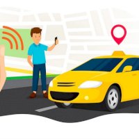
Being adaptable to times and trends is paramount, Uber-like software is a great example of these necessary advances. Human beings, as customers, tend to be very visual. Also, as a company, this software is the face you will show the world. So your design, color palette and even the logo must convey who you are.
We'll give you some tips so that both your app created by ToolRides and your accounts on other platforms are eye-catching. You'll know how color psychology really influences what future clients see and feel. As well as the advantages of applying this to your brand, so that you can see a significant change after tweaking details that seemed minor.
Using color psychology
Being careful with details such as color, or maintaining a harmonic palette, seems like something superficial, but it's of the utmost importance. Color psychology is responsible for analyzing how people behave before the spectrum of colors. If the different shades and hues we see cause any type of reaction. Something that may seem as insignificant as a color can influence what we decide to buy.
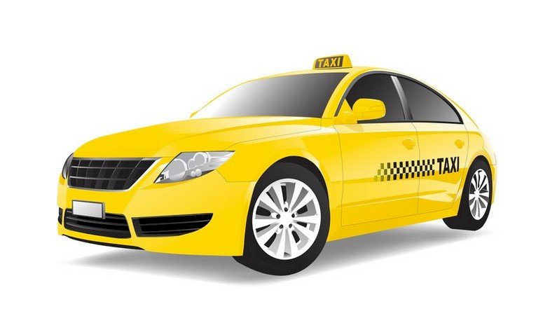
Even if you're a transport service, you're not exempt from this. Isn't yellow, black and white the palette that is always associated with taxis? These are eye-catching, stand out from afar alerting potential customers to the approach of transportation. However, this has been modernized, especially when looking to create an app like Uber.
Marketing and color branding
Color psychology is one of the tools used by marketing and branding. Since it helps change the perception of the product or service to what is convenient. For example, would a service that had designs with muted colors attract more attention? No, because this doesn't draw glances, nor does it give the feeling of being trusted, on the contrary, it can even show little attention and lack of professionalism.
Even the Color Marketing Group company, which specializes in that, indicates that 85% of the time something is purchased, it's because of color perception. Red, for example, stimulates the appetite, which is why large restaurant chains use it. Yellow draws attention wherever it's placed, which is why it's one of the favorites for brands.
What does each color represent and convey?
As color has the ability to stimulate and manipulate mood, it's essential that knowledge is acquired on the subject. For professionals such as architects, entrepreneurs, gardeners, designers, cooks, advertisers and even for daily life.
So here you'll find a small list of what each color represents, so you can choose or modify the ideal colors for your brand. And, in turn, decide how the design of your Uber-type software will be. Clear examples, with their positive and negative characteristics are:
-
Red is strength, it's a strong stimulant as it seems to be full of energy. Passion, danger and even rebellion are associated or identified with this color. It's perfect for drawing attention to texts, and is often used for customers to make quick decisions, eye-catching for buttons. You can't abuse this color as it can be aggressive or visually tense.
-
Orange is like red, demonstrative of a lot of energy, vitality or fun. It's usually, in some cultures, considered as an optimistic color, which calls for action. So it can be perfect for your transport service. It shouldn't be used in excess because instead of giving visibility it can be overwhelming for the user.
-
Blue, this color is pleasing to the eye and shows intelligence, confidence and serenity. It's fresh while still being corporate, so many companies tend to use it because it conveys security. Perfect for travel agencies, as long as it's used in moderation so as not to give a cold feeling.
-
Green is usually a color closely associated with nature, because it's quite organic. But, it represents joviality, hope and from a certain point of view, innovation. It has even been studied that for the human eye, it's used to provide calm and stability. Recommended for messages and promotions of products or services.
-
Yellow is related to happiness, speed, abundance and strength. Appropriate for logos, posters, as it evokes positive feelings. However, this color should be used carefully, because it's so bright and striking that it can play against us. It's good for specific items, that way it doesn't end up being visually irritating, affecting customers.
Persuasion through what we see
The color and how a product or service looks affects 93% of the purchase decision. And using it properly can increase the recognition of your company by 80%. Wouldn't it be great to create an app like Uber using this theory and see an increase in trips with that percentage? Because of this theory, people often have many objects or rely on services that use their preferred color.
When making an app, this must be taken into account, for example, men tend to have blue, green and black as favorites. On the other hand, women feel more affinity with blue, purple and green. This according to studies by marketers who apply their knowledge to design. In short, applying these suggestions using a non-verbal language can be beneficial for your company.
It's time to step into action
When creating an Uber-like software, there are many variants that we must consider. The aesthetic and essential don't escape us, so prior knowledge of the market and your potential customers is the way to better achieve the goal. This way, you'll know which colors are suitable to highlight messages, attributes and values of your brand. Don't wait any longer, hire ToolRides to help you with the modernization of your transport company.